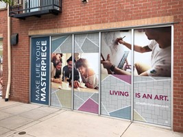
Humans process unfathomable quantities of information through sight alone.
Consider this crazy statistic: The human brain processes images in just 13 milliseconds, with the eyes shifting gaze three times per second. People can recognize and comprehend dozens of pictures in a fraction of a second!
This pace is something verbal communication could never match. That's one reason design is sometimes called the "visual language" that shapes our world.
3 Design Principles to Strengthen Your Marketing Materials
If you want to grab attention, evoke emotions, and make complex ideas simple, design is king. Here are three tips for communicating strong ideas in seconds.
1. Differentiate Your Brand
Is your brand chic, silly, sophisticated, classic, or dependable?
A clear identity distinguishes your company and builds confidence in your target customers. Are your marketing pieces connected through cohesive brand elements? If you removed the business name from your designs, could viewers distinguish you from the competition?
Find ideas that encapsulate your brand and communicate this core identity through typography, colors, and images that are streamlined across every medium.
2. Define a Focal Point
Like writers use a hook to grab readers, visual focal points attract viewers and pull them in.
Begin each design with one question: what is the first piece of information I need people to know? Emphasis draws attention to an area or object as the focal point. Whether it's a bold black headline or a lonely child peering out of a brochure, emphasis is the door through which viewers enter your composition.
Here are three design examples:
Images - The biggest images on a page will naturally command attention, but the most compelling images include faces, flavorful foods, bold geometric patterns, gorgeous nature scenes, and humorous photos.
Colors - Pinks and reds scream for attention, but color contrasts can create powerful focal points too. Brighter colors intensify, and cooler colors recede, so on a dark blue banner, a bright yellow headline will leap forward.
Contrast - Equally weighted objects on a page force competition among them, which confuses readers. Instead, allow for plenty of white space around your focal point. Reduce sizing and color of less important objects or use selective grouping to set key elements apart.
3. Delight Viewers with Perfect (and Imperfect!) Proportions
Proportion helps you group your design into sections using grids or patterns as an anchor.
Whether it's margins on a page, sidebars on a poster, or pull quotes in a newsletter, proportion communicates importance and helps the brain decode information. When designing from scratch, build a visual map to sketch your basic layout. Here is one helpful margin guide to get you started.
Proportion is rarely noticed until something is out of proportion, so have fun making rules - and then breaking them. Four equal text columns are pleasing, but one narrow column near a graphic splashing across three grids is compelling. An enormous Snickers bar is tantalizing, but a Butterfinger carried by four tiny ants is downright provocative!
Want help making your layouts shine? From design to printing, we're here to help. Reach out today!


