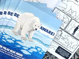
Direct mail is a form of advertising and communication that has been used for years. Postcards, business cards, letters, flyers, magazines, coupons, and newsletters are all examples of direct mail, and the success rate for these forms of business advertising might be higher than you’d expect.
When done well, direct mail is a tangible, engaging way to interact with existing and potential customers. More than 70% of Gen X consumers believe physical mail is more personal than online digital communications and say they are more likely to read it than email.
So, how can you maximize your direct mail campaigns? One of the most important factors is your pieces' aesthetic appeal and design. A powerful image will grab your viewer’s attention and make them more likely to read the rest of your message.
3 Ideas for Creating Impactful Direct Mail Visuals
With the right strategies, you can ensure your direct mail captures attention, conveys your message effectively, and drives engagement. Read on to learn how to make your direct mail visuals truly impactful.
1. Properly Place Your Images
The placement of images on your direct mail is crucial in ensuring that your recipient absorbs the rest of the information on the piece.
Which area of the design, or which specific words, do you want the viewer’s eye to be drawn to first? One psychological trick many graphic designers utilize is having the subject in the image (person) looking in the direction of, or even pointing to, the text to draw the reader’s eye in that direction.
Leave some white space around your images to avoid a cluttered or distracting layout. Allow the format of your mail piece (tri-fold brochure, postcard, etc.) to guide the placement of your images. Well-placed images will be much more striking and engaging for your viewers.
2. The Role of Color
When choosing the right images to include in your direct mail, don’t forget the importance of color!
While you may have already incorporated your signature company colors through the logo, header/footer, and font color, use images with the same color tones to create consistency and an even more compelling aesthetic appeal.
For instance, if people are in your chosen image, what color is their clothing? What color is the primary background of the photo? What feelings do those colors evoke, and how will that impact the overall message you’re portraying? Keep these considerations in mind when choosing the images for your direct mail.
3. Test the Effectiveness
Ultimately, the best way to know which images connect best with your customer base is by analyzing how they respond to different designs!
One way to do this is by conducting A/B testing, which involves sending two mail designs (each identical except for the image) to an equal number of people and then adding a URL or QR code that recipients can use to get more information. You'll see which image generated a higher response rate by tracking the number of people who utilized each code. This way, you can decide which pictures to include in future mail pieces and maximize your marketing budget.
Contact our company today for high-impact, quality direct mail pieces, and all your other printing needs!


