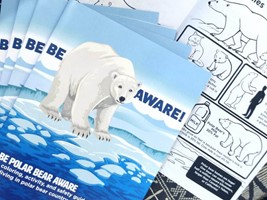
When creating a custom brochure for your brand, it’s vital to choose a design that is eye-catching and informative enough to leave both a great first impression and last a long time in someone’s home.
Your brochure should be more than a fleeting piece of advertising; it should be a statement, an experience, and ultimately, something worth keeping for customers. To achieve this, your brochure must combine captivating content and thoughtful design to create a piece of collateral your audience will want to flip through repeatedly.
Prioritize the Front and Back Covers
The front cover of a brochure is your first chance to grab attention. Use bold, eye-catching graphics, readable text and an engaging headline to draw readers in. It’s also important to choose high-resolution images that reflect the essence of your brand. The use of vibrant colors also can set the tone and mood of your brochure, while remaining cohesive with your branding.
Also, consider the outside back cover, which needs to be just as appealing as the front. If your brochure is lying face-down, having an engaging back cover can still draw plenty of interest.
Invest in the Quality of Your Brochure
Consider various binding methods, paper weights and special printing finishes to add tactile value to your brochure and help it stand out to customers. Matte or glossy finishes along with special techniques like embossing, debossing and foiling can add a touch of elegance and professionalism.
Utilizing high-quality images, professional photographs and custom graphics is another way to enhance visual appeal.
Create a Striking, Reader-Friendly Design
When designing your brochure, choose fonts that are stylish, easy to read and align with your brand. A mix of serif and sans-serif fonts can create a pleasing contrast and hierarchy within your text. Ensure that headings are prominent, while the body text remains clear and legible.
Some additional tips to keep in mind for creating an effective, user-friendly design are:
- Prioritize the most important parts of your
- Switch up the arrangement of texts and images on each panel
- Avoid long paragraphs and limit text length to digestible sections
- Utilize bulleted lists and infographics
Incorporate Content That Interests Your Audience
Add value to your brochure by including information readers will find interesting and helpful, incentivizing them to hold on to your brochure for longer. This can include high-quality images, graphs or written copy that provide insightful content relating to not only your brand but also relevant topics in the industry that appeal to your audience. Consider incorporating:
- How-to guides and directions
- Product descriptions and unique features
- Tips and tricks
- FAQs and testimonials
- Fun facts about your brand or industry
Include a mix of interesting facts and information alongside dynamic storytelling to engage your readers and ensure your brochure remains valuable long after its initial release.
With compelling content and an engaging design from front to back cover, you can create a long-lasting brochure that’s worth keeping for your customers. Need help getting started with the design? Get in touch with Allegra today to discuss your next project!


